

Which one, 1st or 2nd or 3rd figure?
Greetings, Anyway to help to create ridgeline by MATLAB
19 Ansichten (letzte 30 Tage)
Ältere Kommentare anzeigen
Greetings,
Anyway to help to create ridgeline by MATLAB as the attache link please?
3 Kommentare
Akzeptierte Antwort
Adam Danz
am 26 Nov. 2019
Bearbeitet: Adam Danz
am 28 Nov. 2019
Here's a demo that creates a number of guassian distributions as input. The code produces an appropriate number of contiguous subplots where you can set the left, right, upper, and lower margins. Then it uses histfit() to compute and plot the density functions of each data. The code extracts the (x,y) values of the density curve and uses them to form a colored patch which replaces the histfit() plots. The axis limits and linked and some plot cosmetics are done to make the plot similar in appearance to the link you provided.
See inline comments for details.
% Generate n distributions
n = 8; % number of distributions
mu = linspace(0,100,n);
sd = (rand(size(mu)) +1).*2;
nSamp = 100; %number of samples per dist.
data = arrayfun(@normrnd,mu,sd,ones(size(mu)),nSamp.*ones(size(mu)),'UniformOutput',false); % req. stats & ML toolbox
yLabs = num2cell(char(64+cumsum(ones(1,n))));
Now we have two key input variables.
- data which is a 1 x n cell array where each element is a 1xm vector of data that will be used to compute a distribution.
- yLabs : a 1 x n cell array of characters used to label each distribution along the y axis.
% Generate figure.
fh = figure();
% Compute axes positions with contigunous edges
n = numel(data);
margins = [.13 .13 .12 .15]; %left, right, bottom, top
height = (1-sum(margins(3:4)))/n; % height of each subplot
width = 1-sum(margins(1:2)); %width of each sp
vPos = linspace(margins(3),1-margins(4)-height,n); %vert pos of each sp
% Plot the histogram fits (normal density function)
% You can optionally specify the number of bins
% as well as the distribution to fit (not shown,
% see https://www.mathworks.com/help/stats/histfit.html)
% Note that histfit() does not allow the user to specify
% the axes (as of r2019b) which is why we need to create
% the axes within a loop.
% (more info: https://www.mathworks.com/matlabcentral/answers/279951-how-can-i-assign-a-histfit-graph-to-a-parent-axis-in-a-gui#answer_218699)
% Otherwise we could use tiledlayout() (>=r2019b)
% https://www.mathworks.com/help/matlab/ref/tiledlayout.html
subHand = gobjects(1,n);
histHand = gobjects(2,n);
for i = 1:n
subHand(i) = axes('position',[margins(1),vPos(i),width,height]);
histHand(:,i) = histfit(data{i});
end
% Link the subplot x-axes
linkaxes(subHand,'x')
% Extend density curves to edges of xlim and fill.
% This is easier, more readable (and maybe faster) to do in a loop.
xl = xlim(subHand(end));
colors = jet(n); % Use any colormap you want
for i = 1:n
x = [xl(1),histHand(2,i).XData,xl([2,1])];
y = [0,histHand(2,i).YData,0,0];
fillHand = fill(subHand(i),x,y,colors(i,:),'FaceAlpha',0.4,'EdgeColor','k','LineWidth',1);
% Add vertical ref lines at xtick of bottom axis
arrayfun(@(t)xline(subHand(i),t),subHand(1).XTick); %req. >=r2018b
% Add y axis labels
ylh = ylabel(subHand(i),yLabs{i});
set(ylh,'Rotation',0,'HorizontalAlignment','right','VerticalAlignment','middle')
end
% Cosmetics
% Delete histogram bars & original density curves
delete(histHand)
% remove axes (all but bottom) and
% add vertical ref lines at x ticks of bottom axis
set(subHand(1),'Box','off')
arrayfun(@(i)set(subHand(i).XAxis,'Visible','off'),2:n)
set(subHand,'YTick',[])
set(subHand,'XLim',xl)

8 Kommentare


Adam Danz
am 27 Jan. 2020
Image Analyst's advice is also mentioned in the subplot documentation tips-section. Calling the subplot function deletes existing axes that overlap the newly created subplot. However, once the subplots are created, you can overlap them by changing their position.
Here's a demo where you set the number of vertically stacked subplots (nSubs) and the amount of overlap (p, a value 0:1).
nSubs = 6;
p = 0.10; % 10%
clf() % clear figure
sh = arrayfun(@(i)subplot(nSubs,1,i),1:nSubs); % create all subplots, default position
arrayfun(@(i)box(sh(i),'on'),1:nSubs) % Turn on axis box
subPos = reshape([sh.Position]',4,[])'; % Get subplot positions
% Change the y position of each plot so that
% all subplots overlap by p percent (0:1).
subPos(:,2) = (sum(subPos(1,[2,4])) - (subPos(1,4) * (1-p)) * (0:nSubs-1)) - subPos(1,4);
% Set new subplot positions
set(sh,{'position'},mat2cell(subPos,ones(nSubs,1),4))

Jacqueline Chrabot
am 19 Jul. 2021
Adam,
I'm trying to reuse this code, to make a plot, except my data is set up in a field where y is depth, x is time and the data fills in columns 1-12 of chlorophyll data. I'm trying to fit gaussian for each colomn and then display them all in the graph you showed. Can you help with this?
Weitere Antworten (2)
Image Analyst
am 28 Nov. 2019
Perhaps you'd be interested in stackedplot(): Pick of the Week
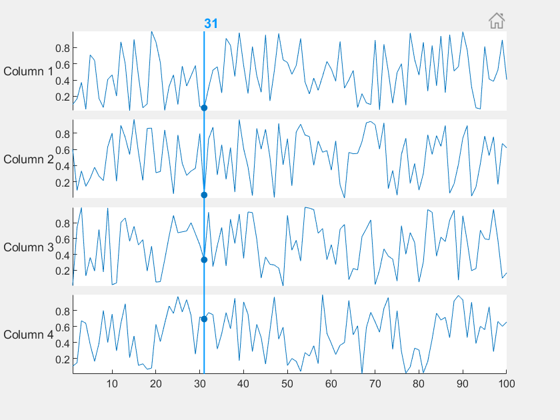
>> doc stackedplot
Introduced in R2018b.
0 Kommentare

Santiago Benito
am 21 Apr. 2020
Bearbeitet: Santiago Benito
am 21 Apr. 2020
Hi there,
Maybe it's a little late, but I stumbled upon the same problem. I really wanted the plots to overlap, so I did the following:
% Number of data plots
n = 8;
% Sample points
N = 100;
% Distribution, example data
distName = 'normal';
mn = linspace(0,1,n);
% Allocate a matrix to store the dataset
yData = zeros(N,n);
% Plot options
mini = -0.3;
maxi = 1.3;
overlap = 0.4;
% Create the data
for ii = 1:n
distCell = makedist(distName,'mu',mn(ii),'sigma',0.1);
yData(:,ii) = pdf(distCell,linspace(mini,maxi,N));
end
% Get the position of each dataset
y = cumsum(max(yData,[],1))*(1-overlap);
% Create the figure with patch & plot
figure, hold on
for ii = n:-1:1
patch([linspace(mini,maxi,N),-mini],[yData(:,ii)+y(ii);y(ii)],mn(ii),...
'EdgeColor','none','FaceAlpha',0.8)
plot(linspace(mini,maxi,N),yData(:,ii)+y(ii),'k','LineWidth',1)
end
hold off
% Other stuff
colormap(spring)
yticks(y)
yticklabels({'A','B','C','D','E','F','G','H'})
xlim([mini,maxi])
The result:

Some thoughts:
- This is not as elegant as the other solutions, but works for me.
- You could add more information to the y-axis with some more coding.
Cheers!
6 Kommentare


Adam Danz
am 23 Apr. 2020
Bearbeitet: Adam Danz
am 23 Apr. 2020
The colorbar in the example above is a bit confusing. There are two yellows that have different values. The lower colorbar should be based on something like the winter colormap which doesn't have intersecting colors with the spring colormap. It's not clear why 2 colormaps/colorbars are needed.
Siehe auch
Kategorien
Mehr zu Data Distribution Plots finden Sie in Help Center und File Exchange
Community Treasure Hunt
Find the treasures in MATLAB Central and discover how the community can help you!
Start Hunting!
Translated by 

Sie können auch eine Website aus der folgenden Liste auswählen:
Amerika
- América Latina (Español)
- Canada (English)
- United States (English)
Europa
- Belgium (English)
- Denmark (English)
- Deutschland (Deutsch)
- España (Español)
- Finland (English)
- France (Français)
- Ireland (English)
- Italia (Italiano)
- Luxembourg (English)
- Netherlands (English)
- Norway (English)
- Österreich (Deutsch)
- Portugal (English)
- Sweden (English)
- Switzerland
- United Kingdom(English)
Asien-Pazifik
- Australia (English)
- India (English)
- New Zealand (English)
- 中国
- 日本Japanese (日本語)
- 한국Korean (한국어)