Explore and Customize Plots
Display Fit and Residual Plots
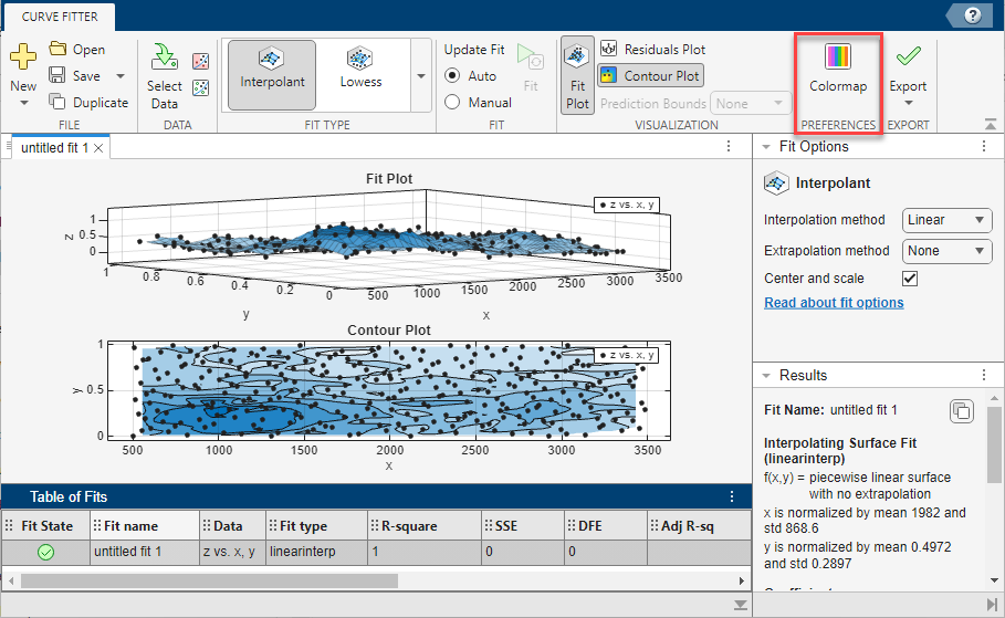
In the Curve Fitter app, within each fit figure, you can display up to three plots simultaneously to examine the fit. Use the buttons in the Visualization section of the Curve Fitter tab to select the type of plot to display.
Click Fit Plot to show the curve or surface fit.
Click Residuals Plot to show the errors between your fit and your data.
Click Contour Plot to show a contour map of a surface fit (not available for curve fits).
This example shows two plots: a plot with a curve fit and prediction bounds and a residuals plot.

When you select Prediction Bounds in the Visualization section of the Curve Fitter tab, two additional curves (or surfaces) are plotted to show the prediction bounds on both sides of your model fit.
Choose which bounds to display: None,
90%, 95%,
99%, or Custom. The
Custom option opens the Set Prediction
Bounds dialog box, where you can enter the required confidence level.

See also Customizing the Fit Display.
Residuals Plot
On the residuals plot, you can view the errors between your fit and your data, and you can remove outliers. See Remove Outliers. This example shows a residuals plot with some excluded outliers.

Customize View and Colormap of Surface and Contour Plots
View surface and contour plots
If you fit a surface, then the fit plot shows your surface fit. Click-and-drag rotation is the default mouse mode for surface plots in the Curve Fitter app. Rotate mode in the Curve Fitter app is the same as using the Rotate 3D button in the axes toolbar of MATLAB® figures. You can change the mouse mode for manipulating plots just as for curve plots. See Using Zoom, Pan, Data Cursor, and Outlier Exclusion.
Tip
To return to rotate mode, turn off any other mouse mode.
If you turn on a mouse mode for zoom, pan, data cursor, or exclude outliers, turn the mode off again to return to rotate mode. For example, click the Zoom in button on the axes toolbar a second time to clear it and return to rotate mode.
If you have a surface fit, use the contour plot to examine a contour map of your surface. Contour plots are not available for curve fits. On a surface fit, a contour plot makes it easier to see points that have the same height.

For polynomial and custom fits, you also can display prediction bounds. On the Curve Fitter tab, in the Visualization section, select a value from the Prediction Bounds list. When you display prediction bounds, two additional surfaces are plotted to show the prediction bounds on both sides of your model fit. The previous example shows prediction bounds. You can see three surfaces on the plot. The top and bottom surfaces show the prediction bounds at the specified confidence level on either side of your model fit surface.
You can also switch your surface plot to a 2-D plot. Your plot cursor must be in rotate mode. Clear any other mouse mode, if necessary. Then, right-click the plot to select Go to X-Y view, Go to X-Z view, Go to Y-Z view, or Rotate Options. All these context menu options are standard MATLAB 3-D plot tools. For more information, see Interactively Explore and Analyze Plotted Data.
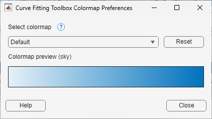
Change Colormap
You can set the colormap for surface and contour plots created using the Curve Fitter app or at the command line. In the Preferences section on the Curve Fitter tab, click the Colormap button. The app opens the Curve Fitting Toolbox Colormap Preferences dialog box that has a drop-down to select the colormap.
When you select a new colormap:
The app applies the colormap to all existing surface and contour plots in the app. Existing plots created at the command line retain the colormap they were plotted with, but all subsequent plots created at the command line are plotted with the new colormap.
The selected colormap persists across MATLAB sessions.
The Reset button in the Curve Fitting Toolbox Colormap Preferences dialog box resets the colormap to the default colormap
sky. If you are using a dark theme, the default colormap isabyss. For more information about themes, see Change Desktop Theme and Colors.
Using Zoom, Pan, Data Cursor, and Outlier Exclusion
You can change mouse mode for manipulating plots. Use the plot axes toolbar to switch to zoom in, zoom out, pan, data cursor, or exclude outliers modes. The Curve Fitter app remembers your selected mouse mode in each fit figure within a session.
Use the axes toolbar to toggle mouse mode in your plots:
The Zoom in, Zoom out, Pan, and Data cursor buttons are similar to standard MATLAB axes toolbar options.
On surfaces, turn all these modes off to return to rotation mode. For surface plots, rotation is the default mouse mode in the Curve Fitter app. See Customize View and Colormap of Surface and Contour Plots.
Clicking the Data cursor button enables data cursor mode, where you can click points to display data tips.
Clicking the Exclude outliers button enables exclude outliers mode, where you can click points to remove or include in your fit. See Remove Outliers.
Customizing the Fit Display
To customize your plot display, use the plot axes toolbar, the options in the Visualization section of the Curve Fitter tab, or the Document Actions button located to the far right of the fit figure tabs. See also Create Multiple Fits in Curve Fitter App.
Axes Toolbar
Use the plot axes toolbar buttons to change the display of the plot legend and grid marks.
The Legend button toggles the display of the legend on all plots in the currently selected fit tab.
The Grid button toggles the display of the grid on all plots in the currently selected fit tab.
Visualization Section
Use the options in the Visualization section of the Curve Fitter tab to customize the display of plots and prediction bounds.
Fit Plot toggles the display of the fit plot in the currently selected fit figure. This button is disabled if the fit plot is the only displayed plot.
Residuals Plot toggles the display of the residuals plot in the currently selected fit tab. This button is disabled if the residuals plot is the only displayed plot.
Contour Plot toggles the display of the contour plot in the currently selected fit tab. This button is disabled if the contour plot is the only displayed plot.
The Prediction Bounds list lets you choose which bounds to display:
None,90%,95%,99%, orCustom. The custom option opens a dialog box where you can enter the required confidence level.
Document Actions Button
To compare plots and see multiple fits simultaneously, you can drag and drop
the fit figure tabs. Alternatively, you can click the Document
Actions button located to the far right of the fit figure tabs.
For example, select the Tile All option and specify
the number and position of tiles you want to display.
Tip
For more space to view and compare plots, as shown next, you can drag and drop the Fit Options, Results, and Table Of Fits panes.

See also Displaying Multiple Fits Simultaneously.
Print to MATLAB Figures
In the Curve Fitter app, you can produce MATLAB figures from the results of curve fitting. On the Curve Fitter tab, in the Export section, click Export and select Export to Figure. The app creates a figure containing all plots for the current fit. You can then use the interactive plotting tools to edit and export the figures in different formats.