Plotting latitude, longitude,and signal strength
5 Ansichten (letzte 30 Tage)
Ältere Kommentare anzeigen

I have a list of latitude and longitude along with signal strength obtained from mobile towers in a certain region. I have all the data in CSV format. In total, I have 4 CSV files.
How can I plot that data in MATLAB?
As a range of signal strength will be shown by different colour and other range will be shown in different colour.
2 Kommentare

Akzeptierte Antwort

KSSV
am 9 Jan. 2019
Read about pcolor, surf, scatter, conourf. All these can be used to plot what you want.
The below link shows the possible plots which can be obtained from MATLAB. YOu can have a look on the link, it has a plot and respective code from which you can learn.
8 Kommentare
KSSV
am 9 Jan. 2019
Bearbeitet: KSSV
am 9 Jan. 2019
To use contour you should be having a matrix data. With your data..this is what I can get:
[num,txt,raw] = xlsread('powerlevel.csv') ;
lat = num(:,1) ;
lon = num(:,2) ;
val = num(:,3) ;
scatter(lon,lat,10,val,'filled') ; colorbar
m = 100 ;
x = linspace(min(lon),max(lon),m) ;
y = linspace(min(lat),max(lat),m) ;
[X,Y] = meshgrid(x,y) ;
Z = griddata(lon,lat,val,X,Y) ;
contour(X,Y,Z) ;
Weitere Antworten (1)

Jacob Halbrooks
am 3 Apr. 2020
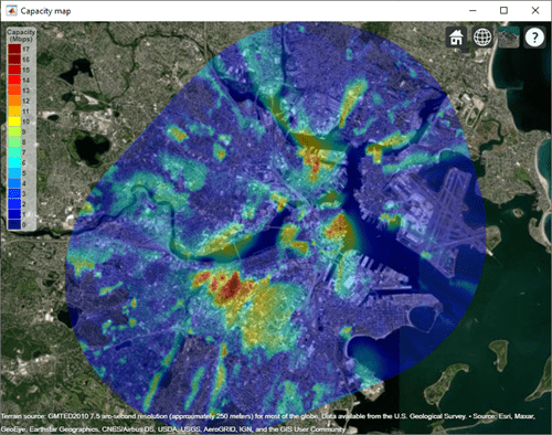
A new feature is available in R2020a to support importing and visualizing propagation data like this. The feature is available in Communications Toolbox and Antenna Toolbox and supports table-based files or data which contains latitude, longitude, and corresponding values like signal strength. You can learn about the feature here, and below is an example contour map that you can create with it:
0 Kommentare
Siehe auch
Kategorien
Mehr zu Geographic Plots finden Sie in Help Center und File Exchange
Produkte
Community Treasure Hunt
Find the treasures in MATLAB Central and discover how the community can help you!
Start Hunting!
Translated by 

Sie können auch eine Website aus der folgenden Liste auswählen:
Amerika
- América Latina (Español)
- Canada (English)
- United States (English)
Europa
- Belgium (English)
- Denmark (English)
- Deutschland (Deutsch)
- España (Español)
- Finland (English)
- France (Français)
- Ireland (English)
- Italia (Italiano)
- Luxembourg (English)
- Netherlands (English)
- Norway (English)
- Österreich (Deutsch)
- Portugal (English)
- Sweden (English)
- Switzerland
- United Kingdom(English)
Asien-Pazifik
- Australia (English)
- India (English)
- New Zealand (English)
- 中国
- 日本Japanese (日本語)
- 한국Korean (한국어)