Scatter plot and linear regression
Ältere Kommentare anzeigen
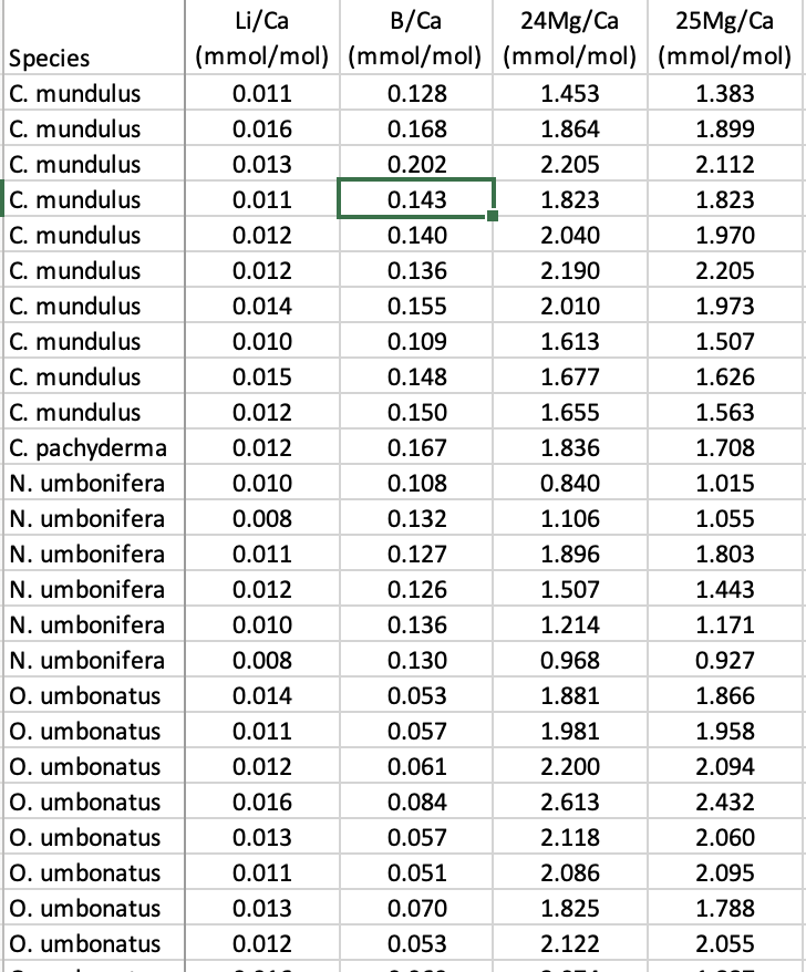
Hi! I have a data set that contains several columns the first is a categorical one with name of different species and the ogther ones are numerical values with chemical measurements for each species. I need to make a xy plot, considering the x will be the values measured for one species and y will be the values from another species. Then I need to do a linear regression to find a slope, below is a example of my data. Can someone help me?
Antworten (1)
It would help to have your data and a description of what you want to plot and regress against what else.
Data = sort(rand(25, 4))+rand(1,4);
figure
hs = scatter(Data(:,1), Data(:,2:end), 'filled');
grid
hlsl = lsline;
species = ["A" "B" "C"];
for k = 1:numel(hlsl)
B(:,k) = [hlsl(k).XData; 1 1].' \ hlsl(k).YData.';
hlsl(k).Color = hs(numel(hlsl)-k+1).CData;
hlsl(k).DisplayName = "Species "+species(k);
end
legend(hlsl, 'Location','best')

This identifies each group and regression by colour. The slopes and intercepts of each regression are in the ‘B’ matrix.
.
Kategorien
Mehr zu Linear and Nonlinear Regression finden Sie in Hilfe-Center und File Exchange
am 29 Apr. 2024
Community Treasure Hunt
Find the treasures in MATLAB Central and discover how the community can help you!
Start Hunting!
Translated by ![]()