Boxplots for multiple conditions and groups (part of a larger toolbox for 2-level factorial data)
Sie verfolgen jetzt diese Einreichung
- Aktualisierungen können Sie in Ihrem Feed verfolgter Inhalte sehen.
- Je nach Ihren Kommunikationseinstellungen können Sie auch E-Mails erhalten.
Anmerkung des Herausgebers: This file was selected as MATLAB Central Pick of the Week
Statistical visualization functions for Matlab.
daviolinplot, daboxplot, and dabarplot are lightweight statistical visualization functions designed to address the limitations of Matlab's built-in tools and to encourage good data visualization practices (by highlighting features of the data crucial for assessing both its quality and the information it conveys).
All three functions:
- Are created for 2-level factorial data but also work with one-factor data
- Can handle different input types (cell or numeric arrays)
- Are easily customizable for emphasizing data features and maximizing reliability
- Export many handles for furher optimization
- Go hand in hand with 2-way (mixed) ANOVA analysis
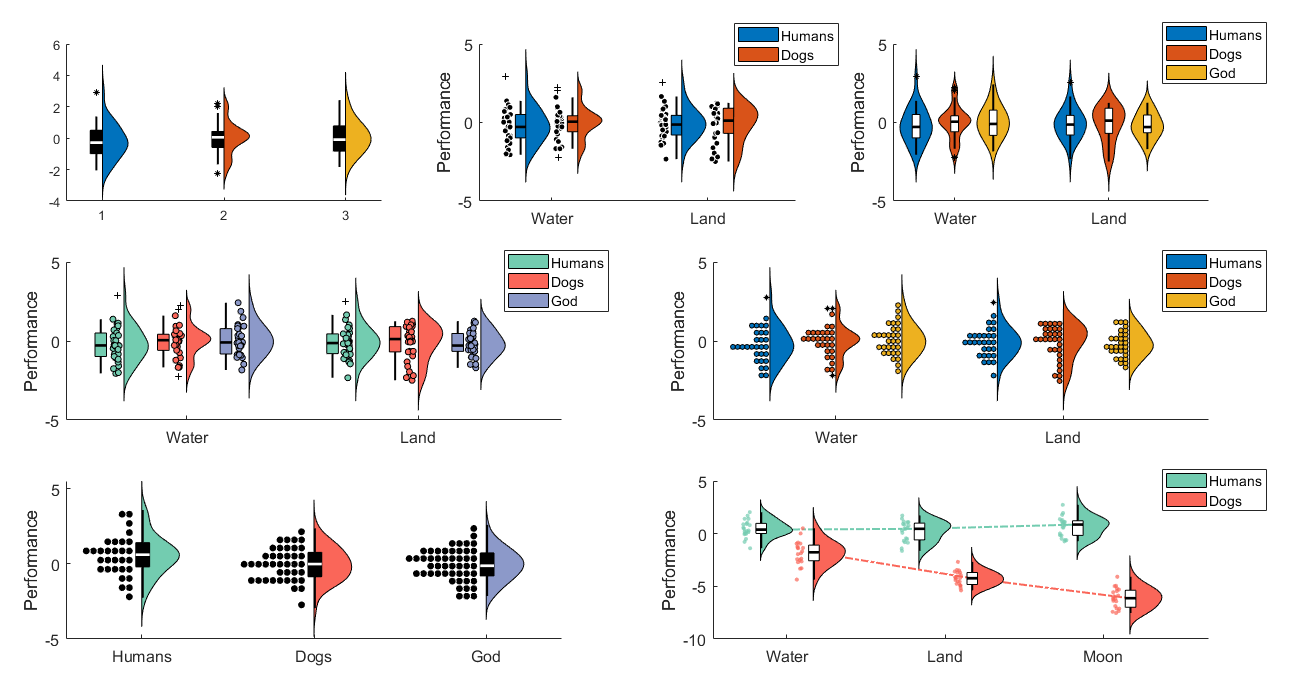
daviolinplot is the best option for highlighitng data distribution properties. It combines boxplots, kernel density, and data scatter to produce different hybrids of violin plots, half-violin plots, raincloud plots, and dotplots. Kernel density highlights the overall shape of the data distribution, pertinent for the normality assumption. Dotplots, while similar in that regard, also they convey information about the exact number of datapoints across the distribution.
Note: dotplots usually require some tweaking to make them look presentable. You may have to play around with bin number ('bins') and marker size ('scattersize') to make it look right.
The examples below illustrate most of the functionality and options (see daviolinplot_demo.m for the code).
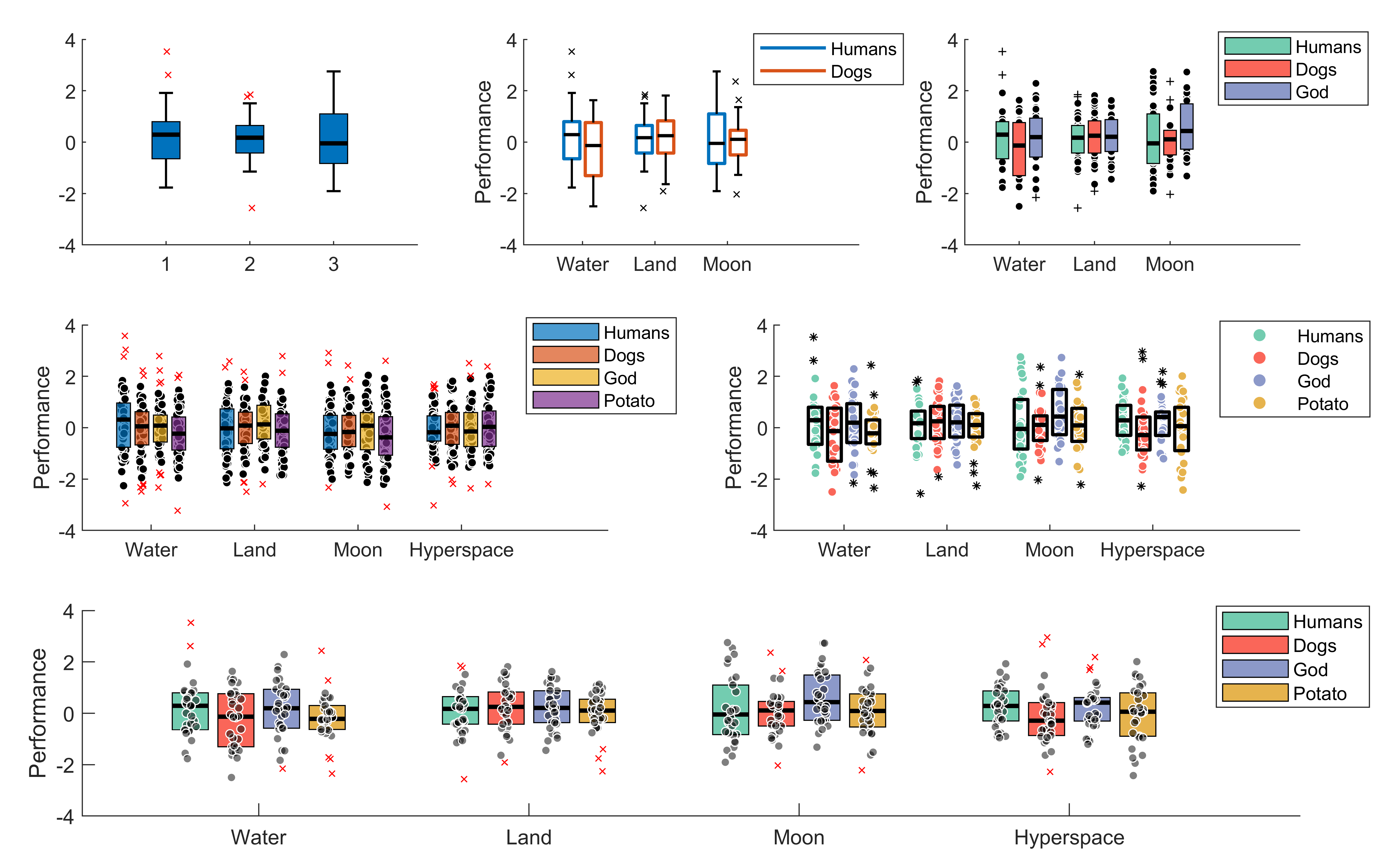
daboxplot is the second best option for highlighting data distribution properties. It mainly does this via different options for combining boxplots with jittered data as well as indicating means and medians on the boxplots to reveal skewness. It also offers many options when it comes to the stylistic aspects of the plots.
The examples below illustrate most of the functionality and options (see daboxplot_demo.m for the code).
The examples below illustrate more recently added options:
- Indicate means on each box (to show skewness)
- Link the boxes within each group (to emphasize interaction effects)
- Link datapoints across conditions (to emphasize within-individual effects)
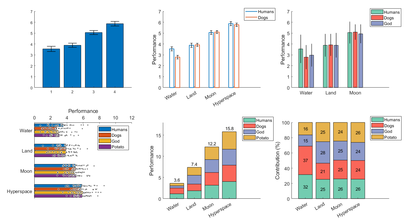
dabarplot is the least ideal for highlighting data distribution properties. However, it still encourages to add error bars (you can choose between standard error, within-subject error, or standard deviation) and allows overlying scattered data. Overall, it is best suited for situations where visualizing data distribution is not as important, when the emphasis is not on hypothesis testing and statistical significance but on effect size. Using stacked bars and adding number values on top of them can be particularly effective in conveying effect sizes among conditions or among groups.
The examples below illustrate most of the functionality and options (see dabarplot_demo.m for the code).
Zitieren als
Povilas Karvelis (2026). daboxplot (https://github.com/frank-pk/DataViz/releases/tag/v3.2.3), GitHub. Abgerufen .
Quellenangaben
Inspiriert: BoxPlotPro
Allgemeine Informationen
- Version 3.2.3 (918 KB)
-
Lizenz auf GitHub anzeigen
Kompatibilität der MATLAB-Version
- Kompatibel mit allen Versionen
Plattform-Kompatibilität
- Windows
- macOS
- Linux
Versionen, die den GitHub-Standardzweig verwenden, können nicht heruntergeladen werden
| Version | Veröffentlicht | Versionshinweise | Action |
|---|---|---|---|
| 3.2.3 | See release notes for this release on GitHub: https://github.com/frank-pk/DataViz/releases/tag/v3.2.3 |
||
| 1.0.9 | Description updates |
||
| 1.0.8 | Edit |
||
| 1.0.7 | Updated description to match feature updates |
||
| 1.0.6 | Description updated |
||
| 1.0.5 | Examples updated |
||
| 1.0.4 | Description updated |
||
| 1.0.3 | More tags added |
||
| 1.0.2 | Box spacing and width options were made more flexible
|
||
| 1.0.1 | Summary edit |
||
| 1.0.0 |


