Main Content

Flight Log Analyzer

Analyze UAV autopilot flight logs

Since R2020b

Description

The Flight Log Analyzer app enables you to load and analyze UAV autopilot flight log data, as well as create a customized series of plots.

To use the app:

Click New Session to create a new session.

You can open saved app sessions by clicking Open Session.

You can save your progress to a MAT-file (.mat) by clicking Save Session.

To load a ULOG file (.ulg) or MAT-file containing a ulogreader object, select Import > From ULOG.

To load a TLOG file (.tlog) or MAT-file containing a mavlinktlog object, select Import > From TLOG.

To load a BIN file (.bin) or MAT-file containing a ardupilotreader object, select Import > From BIN.

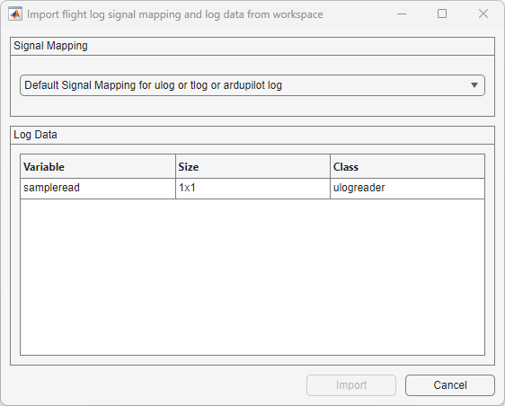
Select Import > From Workspace to load a ulogreader object, mavlinktlog object, ardupilotreader object, or custom log data and a flightLogSignalMapping object from the workspace.

Click Add Custom Signal to add a custom signal for custom signal mapping.

Click Add Figure to add a new figure for plotting.

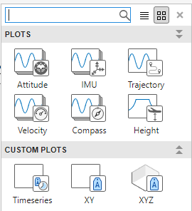
You can add one or more predefined or custom plots to a figure from the plot gallery. To see all available plots in the plot gallery, click the down arrow on the right side of the gallery.

Predefined Plots

  • Attitude — Adds plots for roll, pitch, yaw angles, as well as body rotation rates

  • IMU — Adds plots for an accelerometer and gyroscope

  • Trajectory — Adds a 3-D plot for the UAV trajectory and reference trajectory

  • Velocity — Adds plots for velocity in the x-, y-, and z-directions, as well as groundspeed and airspeed

  • Compass — Adds plots for a magnetometer, estimated yaw, and course angle

  • Height — Adds a plot for GPS, a barometer, and estimated altitude

Custom Plots

  • Timeseries — Adds a blank plot for timeseries data

  • XY — Adds a blank plot for 2-D data

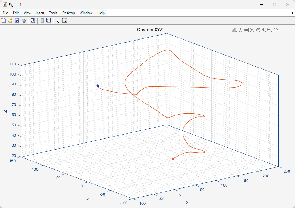
  • XYZ — Adds a blank plot for 3-D data

You can delete the selected figure or plot by clicking Delete.

Click Add Function to add a new annotation function.

The added functions are listed in the gallery in the Annotate section.

Click Manage Function to edit the functions in the gallery using MATLAB® editor or delete the functions from the gallery.

Click 2D Map to view or hide the satellite image map with logged GPS data.

Click 3D Map to view or hide the 3D map with logged GPS data.

Note

The app requires internet access to retrieve satellite imagery.

Note

3D map requires Mapping Toolbox™ license.

Click Data Cursor to enable data cursor.

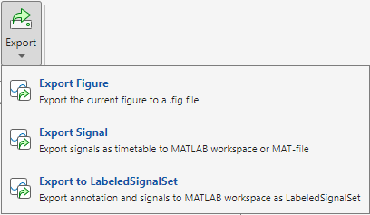
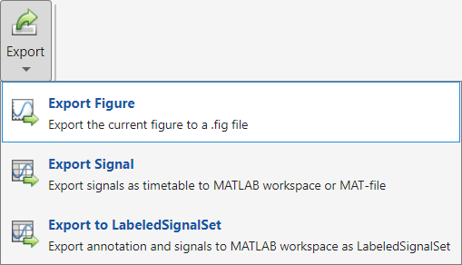
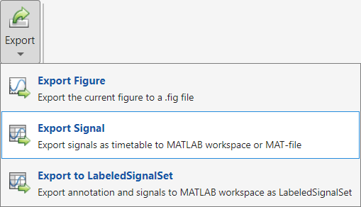
Select Export > Export Figure to export the currently selected figure as a .fig file.

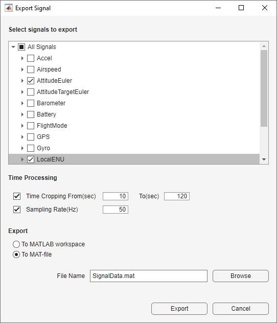
Select Export > Export Signal to export the signals as a timetable to the MATLAB workspace or a MAT file (.mat). You can also crop and resample the exported signal.

Select Export > Export to LabeledSignalSet to export the annotations and signals to the MATLAB workspace as a labeledSignalSet object.

Flight Log Analyzer app

Open the Flight Log Analyzer App

  • MATLAB Toolstrip: On the Apps tab, under Robotics and Autonomous Systems, click Flight Log Analyzer.

  • MATLAB command prompt: Enter flightLogAnalyzer.

Examples

expand all

Use the Flight Log Analyzer app to load and analyze UAV autopilot flight log data from a ULOG file.

Open Flight Log Analyzer App

In the Apps tab, under Robotics and Autonomous Systems, click Flight Log Analyzer.

Alternatively, you can use the flightLogAnalyzer function from the MATLAB® command prompt.

Import ULOG File

Select Import > From ULOG to load the UAV flight log data from a ULOG (flight.ulg) file.

flightloganalyzer_import_24a.png

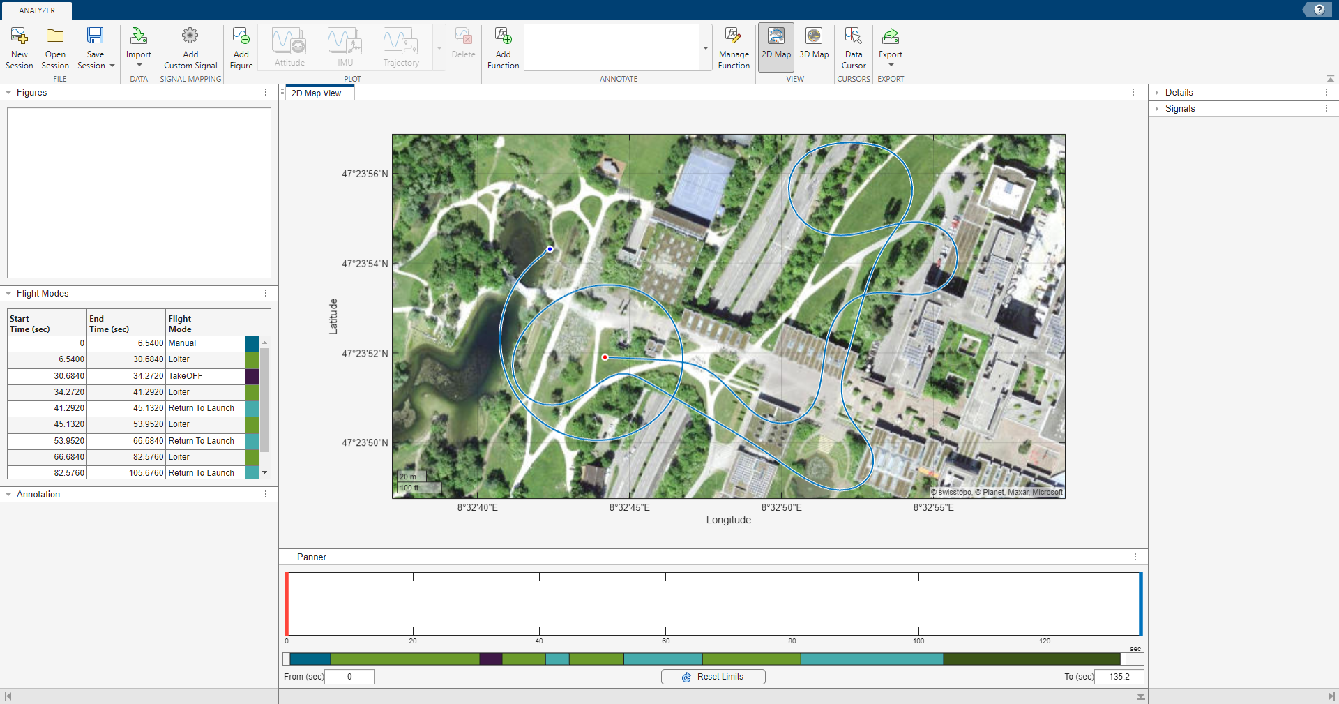
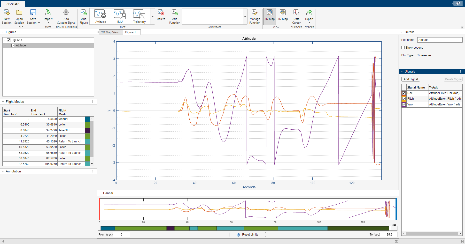
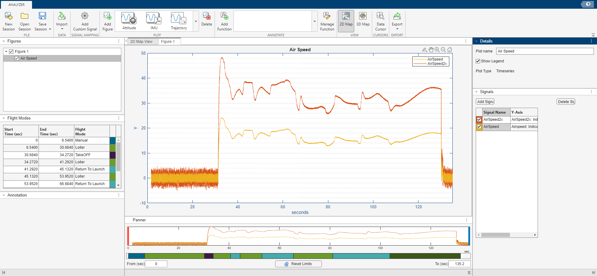
By default, the app displays a 2D map with logged GPS data and the flight modes as a table. The flight modes, along with their corresponding start and end times, are tabulated in the Flight Modes pane.

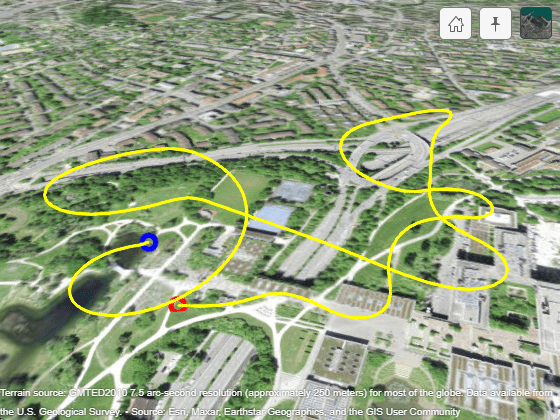
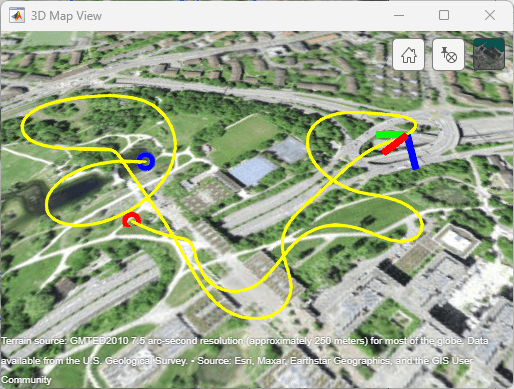
To display a 3D map of the logged GPS data, select 3D Map on the app toolstrip. This opens a new window with the 3D map view. 3D map requires Mapping Toolbox™ license.

flightloganalyzer_3d_map.png

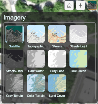
In the 3D map window, you have the option to return to home view, pin the window, and choose different basemaps.

Add Figures

  1. To create a new figure for plotting, click Add Figure. The app adds an empty figure to the plotting pane. You can continue adding additional figures using this process.

  2. The app adds a figure item corresponding to the new figure to the list in the Figures pane. Select the check box to the left of the listed figure item to show all plots in the figure. Clear the check box to hide them.

  3. To rename a figure, select the associated figure item in the Figures pane, click the Figure name box in the Details pane, and type a new name.

  4. To delete a figure, select the figure item in the Figures pane and click Delete on the app toolstrip. Deleting a figure deletes all plots in the figure.

Creating a figure enables the plot gallery. You can add one or more predefined plots or custom plots to a figure from the plot gallery.

Add Predefined Plot

  1. To add a predefined plot to a figure, select one of the six predefined plots from the plot gallery.

  2. For example, click Attitude to add plots for rotation angles and rotation rates to the figure. You can continue adding additional plots to a figure using this process.

  3. The app adds a plot item corresponding to the new plot under the associated figure item in the Figures pane. Select the check box to the left of the listed plot item to show the plot in the figure. Clear the check box to hide the plot.

  4. To rename a plot, select the associated plot item in the Figures pane, click the Plot name box in the Details pane, and type a new name.

  5. Select the Show Legend check box in the Details pane to show the legend on the plot. Clear the check box to hide the legend.

  6. To rename the axis labels, double-click on the predefined labels and type a new name.

  7. To delete a plot, select the plot item in the Figures pane and click Delete on the app toolstrip.

Edit Plot Signals

  1. The Signals pane displays the signals in the selected plot as a table. The Signal Name column contains the names of the signals. The subsequent columns each contain the data associated with that signal for a specific axis.

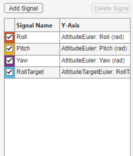
  2. Select the check box in front of a signal item to show that signal in the plot, and clear the check box to hide the signal. The color around the check box is the color of the signal in the plot.

  3. To add a new signal to the selected plot, click Add Signal.

  4. To rename the signal, double-click signal in the Signal Name column and type a new name.

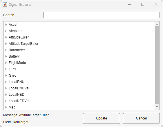
  5. To add or update the signal data, double-click the Y-Axis column of the signal to open the Signal Browser window. Choose from available signals.

  6. Select one of the signals from the Signal Browser window and click Update.

  7. To delete a signal, select a signal from the Signals pane and click Delete Signal.

Change Plot Focus Using Panner

  1. For timeseries plots, use the Panner to focus on data segments in the x-axis range. The Panner is a strip plot beneath the main plot. To focus on a section of the main plot, drag the red and blue handles to the start and end positions, respectively, of the desired data segment.

  2. You can also move the handles by typing new values in the From (sec) and To (sec) boxes, beneath the strip plot. To reset the handles to their default values, click Reset Limits.

  3. The color next to each flight mode in the Flight Modes pane represents that flight mode in the color bar under the strip plot in the Panner pane.

Add Custom Plot

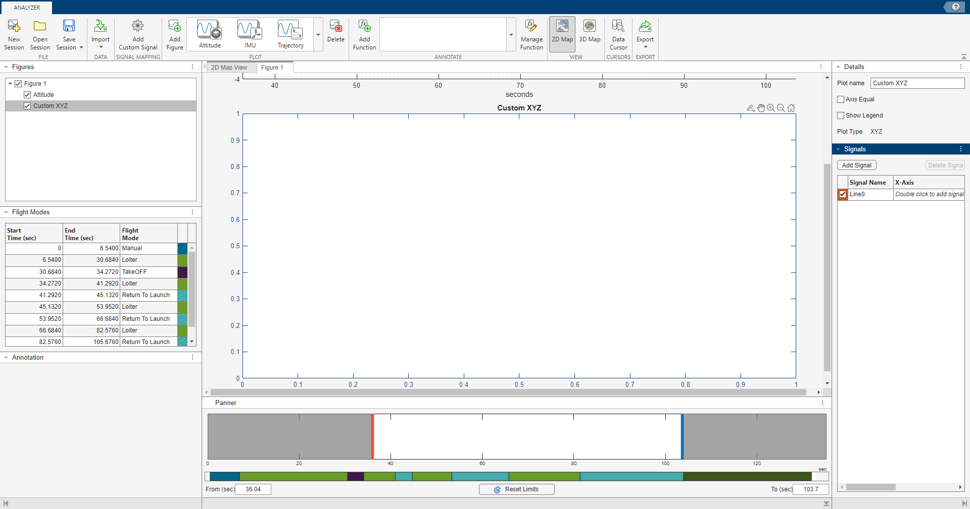
  1. To add a custom plot to a figure, select one of the three custom plots from the plot gallery. You can add the new plot to the previously created figure or to a new figure.

  2. For example, click XYZ to add a blank plot for 3-D data.

  3. To add a signal to the plot, click Add Signal in the Signals pane.

  4. To rename the signal, double-click signal in the Signal Name column and type a new name.

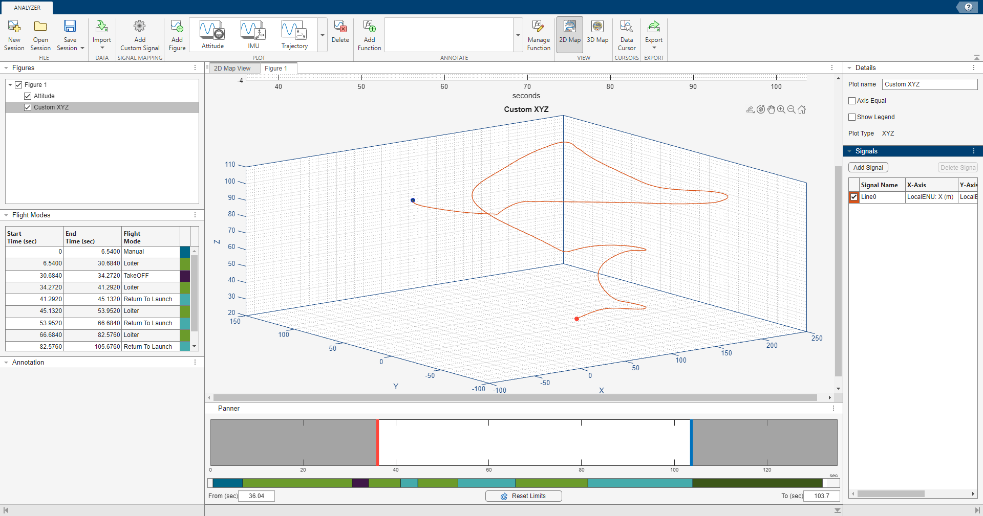
  5. To add signal data to the X-Axis, Y-Axis, and Z-Axis columns, double-click the data field columns of the signal to open the Signal Browser window. Choose from the available signals.

For example, to create a trajectory plot in local east-north-up (ENU) Cartesian coordinates:

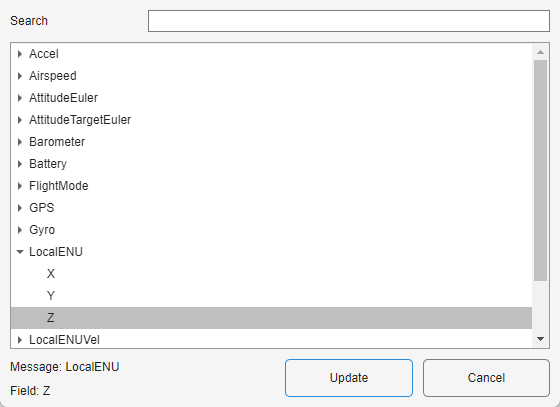
  1. Double-click the X-Axis data field for the desired signal and find the LocalENU signal group in the Signal Browser pane.

  2. Expand the group and select the signal X.

  3. Click Update to update the signal with X-Axis data.

  4. Repeat these steps to update the Y-Axis and Z-Axis fields with Y and Z data, respectively, to create a 3-D trajectory plot.

Export Figure

Select Export > Export Figure to export the current figure to a .fig file.

  1. Select one or more plots in the current figure to export, specify a file name for the .fig file, and click Browse to the select the destination folder. Click Export to export the selected plots to the .fig file. The app opens a figure containing the selected plots in a new figure window.

  2. To export each plot as an individual figure, select Export each plot as individual figure. Specify the file name prefix for the .fig files, and click Browse to the select the destination folder. Click Export to export the selected plots as individual .fig files. The app adds the plot names as the suffixes of the specified file name prefix for the exported .fig files. The app opens each exported plot in individual figure window.

Export Signal

Select Export > Export Signal to export the signals as a timetable to the MATLAB workspace or a MAT file (.mat).

  1. Select the signals to export. The app retains this selection throughout the session.

  2. To export the signals to a MAT file, select To MAT-file and specify a filename for the MAT file. To select a destination folder for the MAT file, click Browse and navigate to the folder to which you want to export.

  3. To export the signals to the MATLAB workspace, select To MATLAB workspace and specify a name for the output workspace variable.

  4. To crop the signals, select Time Cropping and specify the time cropping limits. By default, the cropping limits are prepopulated with the limits you set using the Panner.

  5. To resample the signals, select Sampling Rate (Hz) and specify the sampling rate. The app resamples the exported signal linearly.

FLAss.png

Save and Open Sessions

You can save the Flight Log Analyzer app session by clicking Save Session. The app writes the current state of the app to a .mat file that you can load by clicking Open Session.

Open Flight Log Analyzer App

In the Apps tab, under Robotics and Autonomous Systems, click Flight Log Analyzer.

Alternatively, you can use the flightLogAnalyzer function from the MATLAB® command prompt.

Import ULOG File

Load the ULOG file.

ulg = ulogreader("flight.ulg")
ulg = 
  ulogreader with properties:

            FileName: "flight.ulg"
           StartTime: 00:00:00.176000
             EndTime: 00:02:15.224000
     AvailableTopics: [51x5 table]
    DropoutIntervals: [0x2 duration]

On the Flight Log Analyzer app toolstrip, select Import > From Workspace. In the Log Data section of the Import flight log signal mapping and log data from workspace dialog box, select the ulogreader object ulg and click Import.

newimport.png

Add Annotation Function

To add a custom function to the Flight Log Analyzer app:

  1. In the Annotate section of the app toolstrip, click Add Function.

  2. In the dialog box, specify the Function name as ThresholdSignalValue.

  3. Select the Label type as ROI.

  4. Click on OK.

The ThresholdSignalValue function is added to the gallery in the Annotate section, since the function is already provided with this example and it is in MATLAB path.

If the function does not exist in the MATLAB path, the app suggests to create a new function and opens a function template in the MATLAB editor. If the function is at a different location, the location must be added to the MATLAB path.

The function can access the flightLogSignalMapping object, complete flight log data, selected signals, and additional optional arguments from the app.

Run Annotation Function

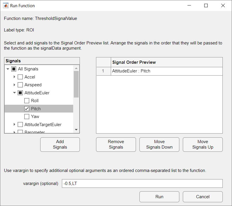
Run the ThresholdSignalValue annotation function to find the regions with signal value less than the threshold value.

  1. In the Annotate gallery, click ThresholdSignalValue.

  2. In the dialog box, select the required signals from the Signals panel.

  3. Click the arrow next to AttitudeEuler and select Pitch.

  4. Click Add Signals.

  5. The added signals are listed on the Signal Order Preview panel.

  6. Specify the threshold value and a string to denote signal value is less than threshold as -0.5,LT in varargin.

  7. Click Run.

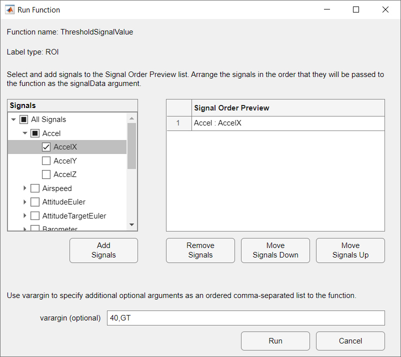
Run the ThresholdSignalValue annotation function again to find the regions with signal value greater than the threshold value.

  1. In the Annotate gallery, click ThresholdSignalValue.

  2. In the dialog box, select the required signals from the Signals panel.

  3. Click the arrow next to Accel and select AccelX.

  4. Click Add Signals.

  5. The added signals are listed on the Signal Order Preview panel.

  6. Specify the threshold value and a string to denote signal value is greater than threshold as 40,GT in varargin.

  7. Click Run.

Create Figures and Plots

In the Plot section of the app toolstrip, click Add Figure to add an empty figure to the plotting pane.

Create predefined Attitude plot.

  • In the Plots section of the plot gallery, click Attitude.

Create custom Timeseries plot.

  1. In the Custom Plots section of the plot gallery, click Timeseries.

  2. In the Details pane, rename the plot as Accel X.

  3. In the Signals pane, click Add Signal.

  4. Double-click the Y-Axis column of the signal and, in the Signal Browser window, type AccelX in the Search box, and then click the arrow next to Accel and select AccelX. Then, click Update.

  5. Rename the signal to AccelX. To rename a signal, double-click its entry in the Signal Name column and type the new name.

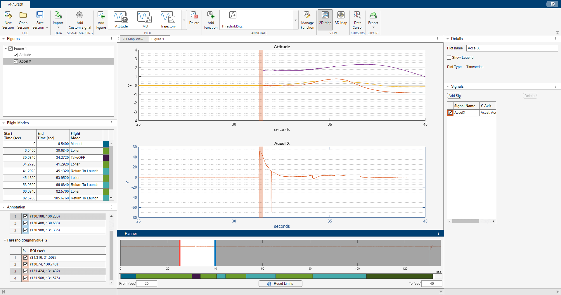
Annotate Plots

  1. In the Figures pane, select the plot on which you want to see the detected region of interest.

  2. In the Annotation pane, select the check boxes to highlight the regions of interest on the plot.

  3. In the Panner pane, drag the red and blue handles to the Start Time and End Time, respectively, to focus on a region of interest. Alternatively, you can type the Start Time and End Time values in the From (sec) and To (sec) boxes, beneath the strip plot.

  4. To rename the default annotation label, right-click on the label and select Rename Label and type the new label name.

Open Flight Log Analyzer App

Use the flightLogAnalyzer function to launch the app.

flightLogAnalyzer

Alternatively, to launch the app from the Apps tab in the MATLAB® Toolstrip, under Robotics and Autonomous Systems, click Flight Log Analyzer.

Import ULOG File

Select Import > From ULOG to load the UAV flight log data from a ULOG file, flight.ulg.

Add Custom Signal

To add a custom signal for custom signal mapping:

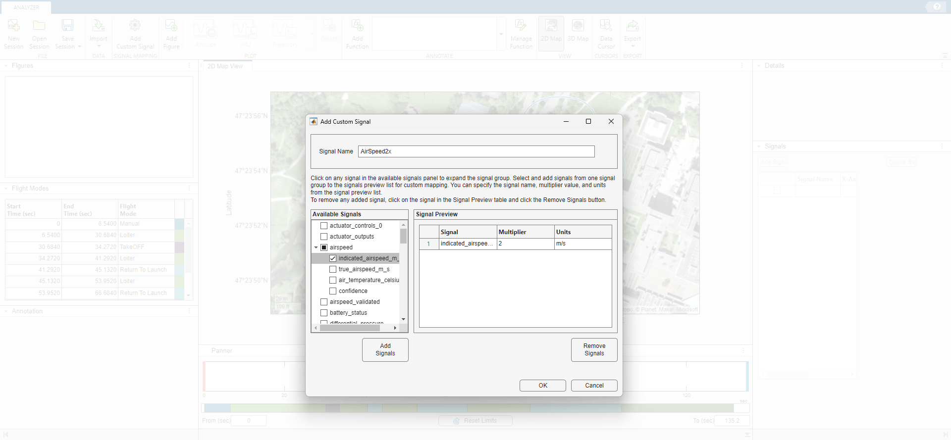
  1. In the Signal Mapping section of the app toolstrip, click Add Custom Signal to open the Add Custom Signal window.

  2. Click any signal in the Available Signals pane to expand the signal group.

  3. Select signals from one signal group, and click Add Signal.

  4. The added signals are listed in the Signal Preview pane.

  5. Specify a signal name in the Signal Name field. The signal name must start with a letter, and can contain letters, numbers, and underscores.

  6. You can also specify the Multiplier value and the Units for the signals in the Signal Preview pane.

  7. To remove added signals, click the signals you want to remove in the Signal Preview pane and select Remove Signals.

  8. Click OK.

Create Figures and Plots

In the Plot section of the app toolstrip, click Add Figure to add an empty figure to the plotting pane.

Create a custom Timeseries plot by following these steps.

  1. In the Custom Plots section of the plot gallery, click Timeseries.

  2. In the Details pane, rename the plot to Air Speed.

  3. In the Signals pane, click Add Signal.

  4. Double-click the Y-Axis column of the signal and, in the Signal Browser window, type airspeed in the Search box, and then click the arrow next to AirSpeed2x and select indicated_airspeed_m_s. Then, click Update.

  5. Rename the signal to AirSpeed2x. To rename a signal, double-click its entry in the Signal Name column and type the new name.

  6. Add another signal from the Signals pane, then click Add Signal.

  7. Double-click the Y-Axis column of the signal and, in the Signal Browser window, type airspeed in the Search box, and then click the arrow next to Airspeed and select IndicatedAirSpeed. Then, click Update.

  8. Rename the signal to AirSpeed.

  9. Select Show Legend in the Details pane to show the legend on the plot.

Enable Data Cursor

You can explore plot data interactively using the Data Cursor.

  1. In the Cursors section of the app toolstrip, click Data Cursor to add a handle to the Panner.

  2. You can drag the handle or the data tips to the plot. Data tips are small text boxes that display information about individual data points.

You can use the data cursor with Timeseries plots, 2D map, and 3D map.

Related Examples

Programmatic Use

expand all

flightLogAnalyzer opens the Flight Log Analyzer app, which enables you to analyze autopilot flight logs.

More About

expand all

Tips

  • If an ArduPilot log file has PSCN, PSCE, and PSCD messages with asynchronous timestamps, the Flight Log Analyzer app linearly interpolates NED and ENU position signals from the log.

Version History

Introduced in R2020b

expand all