Create Plots Using Simulation Data Inspector
R2026bPlots can help showcase important features or trends in your data and allow you to share your findings with others. Using the Simulation Data Inspector, you can organize visualizations across multiple tabs (since R2026b), select from a variety of visualization types and layouts, and customize plot and signal appearances to present your data most effectively.
Add Visualizations
This table lists the visualizations available in the Simulation Data Inspector.
| Icon | Visualization Name | Description |
|---|---|---|
 | Time Plot | Plot your signal data as a function of time. Time plots are the default visualization for each subplot. |
 | Array | Plot multidimensional data including variable-size signals. For an example, see View Multidimensional Signals Using the Array Plot. |
 | Map | Plot a route using longitude and latitude data on either a street or satellite view. For an example, see View and Replay Map Data. |
 | Sparklines | Plot many signals at once. For an example, see View Many Signals Together Using Sparklines. |
 | XY | Plot relationships between time-aligned signals. For an example, see:
|
 | Text Editor | Add notes, observations, and conclusions to your data with a rich text editor. |
To view available visualizations in the Simulation Data Inspector, click
Visualizations and layouts  . To add a visualization, click or drag the
visualization icon onto the subplot.
. To add a visualization, click or drag the
visualization icon onto the subplot.
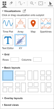
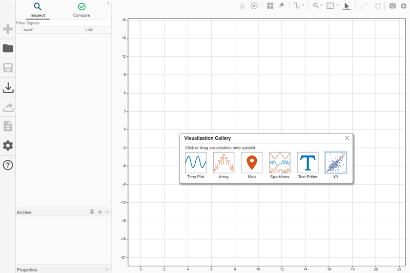
When you have many subplots, you can open the Visualization
Gallery in a separate window and reposition it within the plot area.
Click Undock Visualization Gallery  , then move the Visualization
Gallery to a different location.
, then move the Visualization
Gallery to a different location.
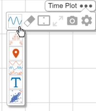
You can also add a visualization to a subplot using the subplot menu.
Pause on the subplot you want to change. The name of the visualization currently in use appears with three dots.
Click the three dots.
Choose a visualization from the Change Visualization drop-down list.
Select Plot Layout
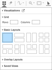
Select from these three types of layouts in the Simulation Data Inspector:
Basic Layouts offer templates for layouts including up to four subplots.
Overlays have overlay subplots in two corners of a main plot.
Grid layouts create a grid of subplots according to dimensions you specify from
1×1to8×8.
To change the layout, click Visualizations and layouts .
Move Between Subplot Layouts
When you plot a signal on a subplot, the Simulation Data Inspector links the signal to the subplot, identifying the subplot with a number. As you move between subplot layouts, the association between the signal and subplot remains, even as the position or visibility of the subplot on which this signal is plotted changes.
Grid layouts follow column-wise numbering, starting with
1 at the top left and ending with 64 at
the bottom right. The numbering system is fixed, regardless of which subplot
configuration you select. For example, if you display four subplots in a
2×2 configuration, the bottom right subplot has index
10. This is because, in the largest possible
8×8 matrix, the subplot in position (2,2) is
10 when subplots are counted column-wise.
Basic Layouts also use the fixed 8×8
column-wise numbering as a base. For example, the top plot in this three-subplot
layout is subplot 1, and the two subplots below it are
2 and 10.

In this three-subplot layout, the indices for the two subplots on the left are
1 and 2, and the index for the right
subplot is 9.

For Overlays layouts, the index of the main plot is always
1, and the indices for the overlaid plots are
2 and 9.
View Simulation Data Using Multiple Tabs
Since R2026b
To organize your plots in the Simulation Data Inspector, use tabs to create separate views, each with its own visualizations and layouts. Each tab has access to all runs and logged signals, allowing you to analyze the same simulation data using multiple views at once.
You can have up to eight tabs open at a time. To open a new tab, click the New tab
 button next to the active tab. Right-click any tab to
open its context menu, where you can:
button next to the active tab. Right-click any tab to
open its context menu, where you can:
Add or rename a tab.
Change the tab color.
Close the tab or close all other tabs.
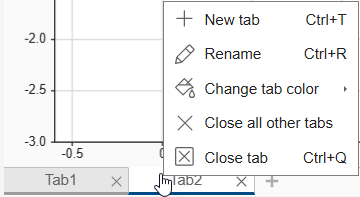
Each tab in the Inspect pane has its own layout and visualization configuration. These operations are synchronized across all subplots and tabs:
Playback controls, such as freeze display and replay
Time-based navigation, such as zoom, pan, and fit to view
Data cursors
Visualization Settings, such as axes settings and time limits
By default, all subplots are linked along the time axis. For more information about linked subplots, see Linked Subplots.
To switch between tabs, click the tab directly in the tab bar or use the tab list
button,  , in the lower-right corner of the
Inspect pane. The tab list displays the full names of open tabs
when tab names are truncated in the tab bar.
, in the lower-right corner of the
Inspect pane. The tab list displays the full names of open tabs
when tab names are truncated in the tab bar.
You can reorder tabs by dragging them to a new position in the tab bar. Tab indices
are based on the current tab order and update when you reorder tabs. For information
about using tab indices programmatically, see getTabByIndex.
View Simulation Data Using Time Plot
Time plots are the default visualization in each tab of the Simulation Data Inspector. To view logged signals using a time plot, in the signal table, select the check box next to the signal name or drag the signal onto the plot. When you add a signal to an empty time plot, the Simulation Data Inspector performs a fit-to-view. You can view more than one signal in a single time plot by selecting multiple check boxes.
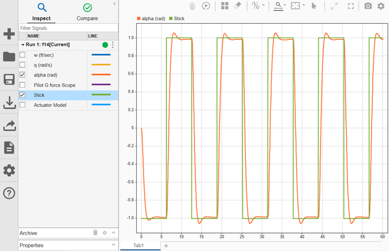
By default, when you add a new signal to a non-empty time plot, the Simulation Data Inspector increases the y-axis limits if the range of the new signal is outside the current view. If the new signal is viewable in the current view, the y-axis limits do not change. To configure the axes not to scale when adding new signals to a plot:
Click Preferences.
Click the Inspect pane.
In the Inspect - Selection section, select Do not scale axes limits when plotting new signals.
Add Text to Plot Layout
To present conclusions, descriptions, or observations alongside your data, add a text editor to your plot layout. To add a text editor below your time series data:
Add a subplot below the time plot. Click Visualizations and layouts
and select the vertically aligned
two-plot layout from Basic Layouts.Click or drag the Text Editor icon from the Visualizations and layouts menu
onto the lower subplot.
The text editor includes a toolbar for rich text formatting, including:
Bullet points
Numbered lists
Hyperlinks
LaTeX equations
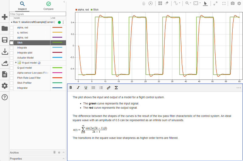
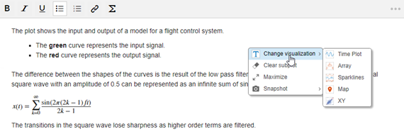
To change the visualization, clear text, maximize the subplot, or take a snapshot:
Use the context menu by right-clicking the text editor subplot.
Use the subplot menu by clicking the three dots in the upper-right corner of the text editor.
Add Subplots to Visualize Data
To view your data using a different visualization or layout configuration while keeping your current view, create a new tab. Each tab maintains its own layout configuration. For the new tab, select the subplot layout that best highlights the characteristics of your data. For example, you can use a basic three-plot layout to display a primary result in the large plot and intermediate signals on the smaller plots.
Click the
button next to Tab1.
A new tab named Tab2 appears.Click Visualizations and layouts
. Then, from Basic
Layouts, choose the 3-plot layout with one large plot above
two smaller plots.Click or drag the Time Plot icon from Visualizations and layouts
onto the lower left subplot.Add signals to the lower right and left subplots.

Customize Time Plot Appearance
After you choose a subplot layout for the tab, you can customize the appearance of
each visualization. To view customization options, click Visualization Settings
 . The menu tabs correspond to the visualizations in
your layout.
. The menu tabs correspond to the visualizations in
your layout.
Time plot customizations include selecting colors, showing or hiding attributes such as the grid and legend, and specifying axes limits. For example, to maximize the plot area, you can move the tick marks, tick mark labels, and legend inside the plot or hide them. Style customizations and y-axis limits apply only to the active subplot in the current tab. All other time plot settings apply to all linked subplots across all tabs.
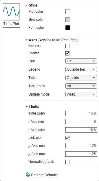
The Limits section gives you control over the limits of the t- and y-axes.
y-axis limits apply only to the active subplot.
t-axis limits apply to all linked subplots across all tabs.
To configure t-axis limits individually for a subplot, unlink the subplot. For more information, see Linked Subplots.
Customize Signal Appearance
To modify the color, line style, and line width of a signal in the Simulation Data
Inspector, click the color swatch in the Line column of the signal
table. To select a signal color from a palette of standard colors use the
Standard pane. To specify a custom color with
RGB values, select the Custom pane. When you
specify the line style and color for a signal in the Simulation Data Inspector, those
settings apply only to the current session.
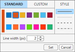
You can also access the line style menu from the Instrumentation Properties for a signal. When you set the line color and style for a signal using Instrumentation Properties, those settings are saved in the model and persist across Simulation Data Inspector sessions.
To access Instrumentation Properties, in the Simulink® Editor, right-click the logging badge for a signal, and then click Properties.
To open the line style menu, click the color swatch next to Line.
To apply these settings to the signal, select the Custom style and color option.
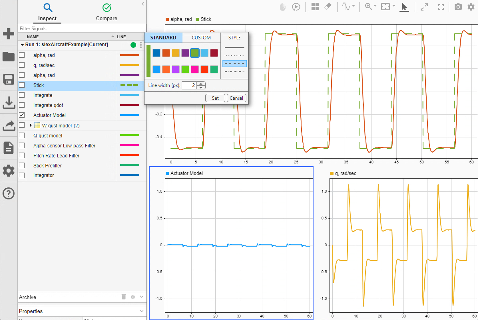
Line style customization can help emphasize differences between signals in your plot. For example, you can change the line style of a signal to dashed to visually indicate that it is an ideal, rather than simulated, signal.
Click the color swatch in the Line column for the desired signal.
Select the dashed option.
Click Set.
Shade Signal Regions
To draw attention to a region of interest in the plotted data, you can shade an area of a time plot.
Add two cursors to the plot area by clicking the arrow next to the Show/hide cursors button and selecting Two Cursors

To emphasize or de-emphasize the shaded area, specify the area to shade relative to the cursors, or edit the shading color and opacity, select Cursor Options. You can specify separate color and opacity settings for the Emphasize and De-emphasize options.
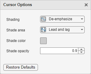
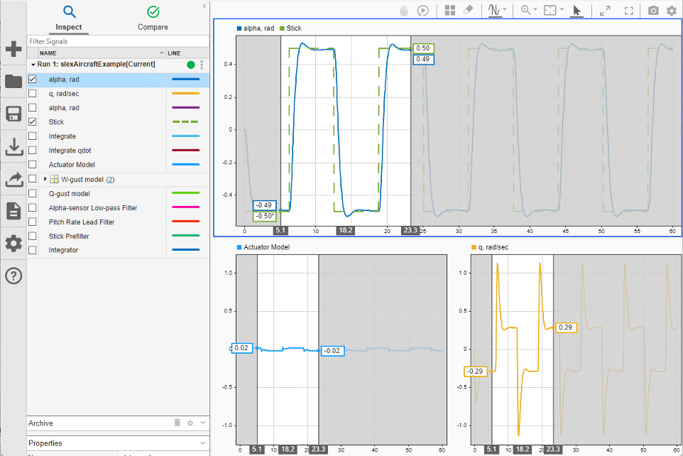
For example, to draw attention to a signal transition, you can place cursors on either side of the transition and obscure the area outside of the cursors with gray shading. In the cursor options dialog box, choose De-emphasize and Lead and lag. For this example, in the Shading drop-down menu, select De-emphasize. In the Shade area drop-down menu, select Lead and lag. The gray shading obscures the area outside of the cursors and highlights the signal region between the cursors. Move the cursors to highlight an area of interest, like the first rising edge of the waveform.
For example, to highlight a signal transition, place cursors on either side of the transition and use gray shading to de-emphasize areas outside the cursors. In the cursor options dialog box, select De-emphasize from the Shading menu and Lead and lag from the Shade area menu. The Simulation Data Inspector obscures the regions outside the cursors with gray shading, drawing attention to the area between them. Shading applies to all subplots containing time plots or sparklines across all tabs.
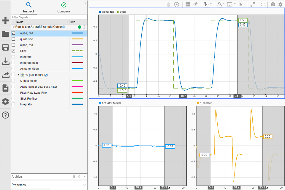
To zoom in synchronously on a region of interest, select Zoom in Time from the Zoom In menu.
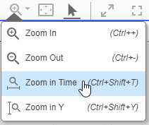
Then, click and drag to select a time span.
Rename Signals
By default, the Simulation Data Inspector uses these naming conventions in the signal table:
| Signal Type | Naming Scheme | Example |
|---|---|---|
| Named signal | <signal name> | MySignal |
| Unnamed signal | <block name>:<port number> | Gain:1 |
| Named multidimensional signal | <signal name>(i×j×...) | MySignal (2×3) |
| Unnamed multidimensional signal | <block name>:<port number> (i×j×...) | Out1:1 (2×3) |
| Named bus | <bus name> | MyBus |
| Unnamed bus | <block name>:<port number> |
|
| Named bus element |
|
|
| Unnamed bus element |
|
|
When a more descriptive signal name would help convey information, you can rename signals in the Simulation Data Inspector. Changing a signal name in the Simulation Data Inspector does not affect signal names used in models. You cannot rename buses or bus elements in the Simulation Data Inspector.
To change a signal name, double-click the signal name in the signal table to enter edit mode. You can also edit the signal name using the Name box in the Properties pane.

Save Plots
To share the visualizations you create in the Simulation Data Inspector:
Create a snapshot of the plots. See Share Simulation Data Inspector Plots.
Generate a Simulation Data Inspector report. See Create Simulation Data Inspector Report.
Delete Signals
To delete a run or signal from the Simulation Data Inspector, right-click the run or
signal and select Delete. To delete multiple signals, use the
Shift or Ctrl key to select multiple signals from
the table. You can also delete signals or runs programmatically using Simulink.sdi.deleteSignal or Simulink.sdi.deleteRun. Deleting a run or signal applies to all
tabs.
Create New Session
To create a new Simulation Data Inspector session, click New
 . Creating a new session clears the Simulation Data
Inspector repository. Logged data and the Simulation Data Inspector share the same
temporary repository. Export any data from previous runs that you want to keep before
creating a new session.
. Creating a new session clears the Simulation Data
Inspector repository. Logged data and the Simulation Data Inspector share the same
temporary repository. Export any data from previous runs that you want to keep before
creating a new session.
When you create a new session, you can choose whether to back up unsaved data to the workspace. Some logging techniques, such as signal logging, use on-demand loading. When the software loads data on demand, a variable is created in the workspace, but the data remains on disk until accessed. By default, when you create a new session, the Simulation Data Inspector does not load this data into memory before clearing the repository. For more information, see Clear Logging Repository.
See Also
Simulink.sdi.clear | Simulink.sdi.deleteSignal | Simulink.sdi.deleteRun | Simulink.sdi.setSubPlotLayout | Simulink.sdi.Signal | plotOnSubPlot

