Understand Histogram Visualizations in the Fixed-Point Tool
R2026bThe Fixed-Point Tool provides two histogram visualizations that summarize the data acquired by the range collection step on the system under design (SUD): the Visualization of Simulation Data and the Simulation Data Overview. These visualizations help you understand ranges of objects in your SUD and quickly spot data type issues.
These histogram visualizations are available in all workflows in the Fixed-Point Tool. In the Iterative Fixed-Point Conversion and Optimized Fixed-Point Conversion workflows, the tool uses the underlying data along with additional requirements you specify, to propose fixed-point data types. In the Range Collection workflow the Fixed-Point Tool does not alter your model, and these histogram visualizations are provided for analysis purposes.
This topic provides a high-level guidance for reading and interpreting data displayed by the histograms in the Fixed-Point Tool.
Histogram Visualizations in the Fixed-Point Tool
The Fixed-Point Tool provides two histograms for visualizing data collected by the tool: the Visualization of Simulation Data histogram and the Simulation Data Overview histogram.
Note
If you run multiple simulations in the tool using a
Simulation.SimulationInput object, the tool plots the data for both
histograms from the merged results of each simulation run. Using multiple simulation
inputs can help you build a more thorough test bench with which to analyze and verify the
performance of your model with fixed-point data types.
Visualization of Simulation Data Histogram
After you set up your SUD and collect ranges in the Fixed-Point Tool, the tool displays the Visualization of Simulation Data histogram. This histogram provides a summary of the bits used by each object in your SUD. Each column in this visualization represents a histogram for one object in your model. Each bin in a histogram corresponds to a bit in the binary word, as displayed on the y-axis of the plot.
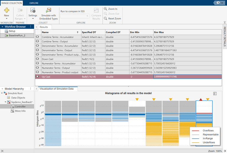
The Visualization of Simulation Data histogram provides a high-level view of the data for each object in the model. You can use this visualization to see a summary of the ranges of objects in your model and to quickly spot numerical issues. Each column in the data type visualization represents a histogram for one object in your model. Each bin in a histogram corresponds to a bit in the binary word. Darker bands correspond to histogram bins with higher rates of occurrence.
This table describes how the histograms are color-coded.
| Color | Legend | Description |
|---|---|---|
Gray | Representable | Gray bands show the representable range of the data type container (Specified DT) for the object represented by each column. |
Blue | In-Range | Results that are in-range of the data type container (Specified DT) are displayed in blue. Comparing the gray and blue bands can help you identify inefficient data types. |
Red | Overflows | Potential overflows are highlighted in red. Columns containing potential overflows have a red triangle at the top of the column. |
Yellow | Underflows | Potential underflows are highlighted in yellow. Columns containing potential underflows have a yellow triangle at the top of the column. |
Selecting a row in the Results spreadsheet highlights the corresponding column in the visualization and vice versa.
Simulation Data Overview Histogram
To more deeply examine the data for a particular model object, expand the Results Details pane on the right side of the Fixed-Point Tool. The Simulation Data Overview histogram displays detailed data for the row you select in the Results spreadsheet.
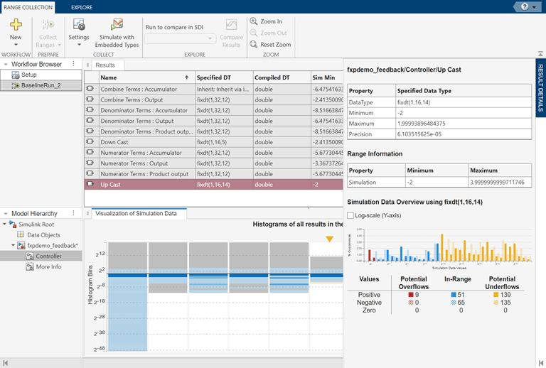
The Simulation Data Overview histogram uses the same color coding as the Visualization of Simulation Data histogram. The title of this plot indicates the Specified Data Type (Specified DT), which the tool uses to determine potential overflows and underflows with this data type applied. This histogram displays positive values in solid colors and negative values in shaded colors.
The X-axis, Simulation Data Values, is binned in powers of 2, corresponding to the bits in the binary word. For example, 20 corresponds to the first integer bit, and 2-1 corresponds to the first fractional bit in the binary word. This representation provides a visual indication of the dynamic range of your data.
The Y-axis, % Occurrences, plots the distribution of occurrences of the signal in each bin during the range collection simulation run. You can hover over bars in the histogram to see exact values. Use the check box to plot this data on a log scale.
The table under the histogram displays counts of positive, negative, and zero values for potential overflows, in-range values, and potential underflows. Note that any constant zero values are not visible in the histogram plot. Zero values will be in range for the majority of cases, but for some data types with a bias, a zero value could overflow.
Interpreting the Overflow and Underflow Data
The Potential Overflows and Potential Underflows reported by the tool compare the difference between the simulated value during the range collection step (with the specified data type override setting) and the specified data type applied to the model. From this data you can understand, for example, how many additional bits are required to avoid overflow. If, on the other hand, fixed-point data types that overflow are used in the range collection simulation, the Potential Overflows data displays zero. In this case, the overflow, regardless of wrapping or saturation, has actually occurred, and the values are capped at the upper bound of the data type. Thus, the simulation has actual overflows rather than potential overflows, so the tool has no data on potential overflows.
Using Histogram Visualizations to Spot Numerical Issues
In addition to highlighting potential overflows and underflows, you can use histograms in the Fixed-Point Tool to spot other potential numerical issues. These examples provide some illustrative use cases.
Identify Inefficient Data Types
You can use the histogram visualizations in the Fixed-Point Tool to identify inefficient use of fixed-point data types. In the Visualization of Simulation Data histogram, columns for which the blue bands which are significantly smaller than the gray shaded area can indicate that the current fixed-point data type has more headroom than what is required to cover the dynamic range of the simulated data. In such cases, you can allocate a smaller data type to reduce the overall footprint of the model.
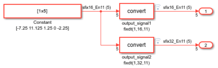
For example, in this model, a Constant block provides a 1-by-5 vector
as input. This signal passes through two Data Type Conversion blocks that
specify output data types of fixdt(1,16,11) and
fixdt(1,32,11), which have different word lengths but the same
precision.
When you use the Range Collection workflow in the
Fixed-Point Tool to analyze this model with the default settings, the tool
returns these histograms for the output_signal1 fixdt(1,16,11) row in
the Results spreadsheet.
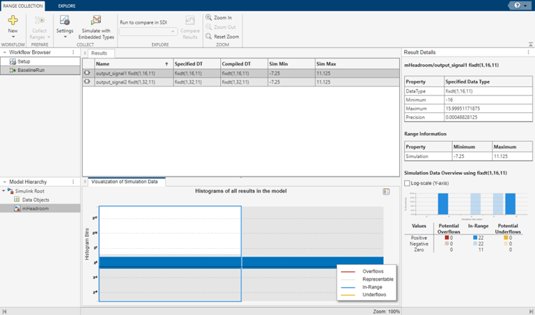
In the Simulation Data Overview histogram, you can see that the two negative values (shaded blue) and positive values (solid blue) are in range. Additionally, the table under the histogram shows a number of zero values, not visible in the histogram, which are also in range.
In the Visualization of Simulation Data histogram, you can see
that the fixdt(1,16,11) data type from the first signal path just fits
the simulated data, while the fixdt(1,32,11) data type from the second
signal path has a generous amount of headroom, which may not be necessary. This type of
analysis is dependent on having a good test bench when collecting ranges with simulation
data.
Spot Potential Modeling Issues
In addition to data type issues, you can use the histograms in the Fixed-Point Tool to spot some common modeling patterns that make conversion to efficient fixed-point data types difficult. The model in this example contains two variations of the same system: one that bundles three signals together through a bus, and one that maintains these three signals as separate signal paths.
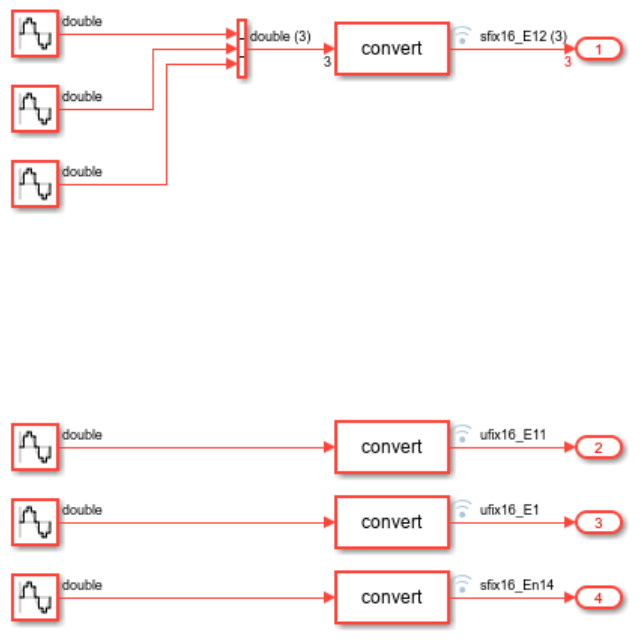
As before, you can use the Range Collection workflow in the Fixed-Point Tool to analyze this model with data type override set to double precision for the range collection simulation.
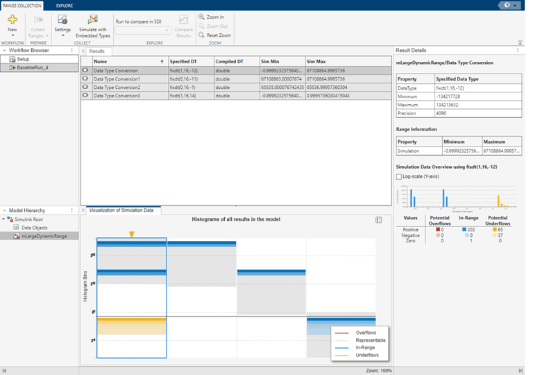
The first column in the Visualization of Simulation Data histogram displays results for the first modeling pattern, in which three signals are grouped together using a bus. With this modeling pattern, a very large dynamic range is required to span the simulation data. On the other hand, if a smaller fixed-point data type is used, one of the three input signals will likely underflow, as indicated in yellow in the histogram. In the second modeling pattern, the three signals are split up and can be assigned fixed-point data types individually. In this case, the fixed-point data type can have a much smaller word length without risk of underflow.

